
categories
HOT TOPICS
- The Accelerator Conundrum
- The Startup Velocity Question
- Man and Superman
- Web 3.0 = (4C + P + VS)
- The Future: End of Capitalism
- Capitalism 2.0
Redesign That: Design That Moves Politics? (Part 2)
By Guest Authors Charley Bush and Kathy Hwang
Continuing our exploration of ways to redesign political websites to engage young voters for the 2008 election, let’s dive into the core needs to consider.
Honestly, we Millennials have never faced serious economic adversity until now. More than ever, we want to have a sense of control and confidence about our decisions. Despite today’s concerns, we have a surprisingly upbeat perspective. We’ll cling to a sense of authenticity and a feeling that we can change things for the better. And of course, as the Facebook generation, we’ll always engage in things that feel personalized, fun, expressive and relevant to our lives. THE DESIGN OPPORTUNITY: Provide a simple but dynamic interface that encourages Millennials to explore the candidates and issues.
THE DESIGN CONCEPT:
This concept proposes that Rock the Vote could team up with an organization like Glassbooth.org to deliver a fresh interface for young voters. To start generating visibility to this site, they can enter the Facebook applet scene (sorry, MySpace), where people can easily share their interests, tag the “Issue of the Day,” and start discussions with friends. A user (like Jane Smith), can set up her own avatar profile and see how her views compare with her friends’.
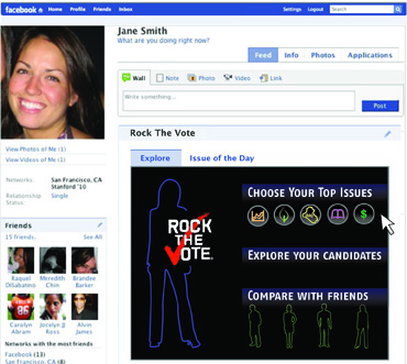
(Concept Facebook applet design for Rock The Vote by 3Strand Innovation)
Taking it a step further, the applet directs Jane to a webpage on the Rock the Vote site dedicated to exploring the unbiased, fact-checked issues. If Jane cares a lot about improving education but could care less about Social Security, she can customize her “My Top Issues” menu to reflect that. Each issue is represented by an interactive colored icon that rotates around her virtual avatar. From here, she can dive directly into any topic she’s curious about, for example how the presidential candidates say they’re going to address climate change.
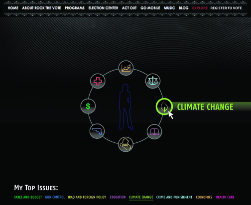
(Concept webpage design by 3Strand Innovation)
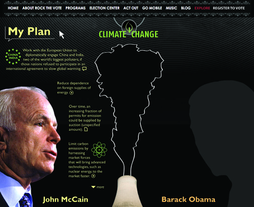
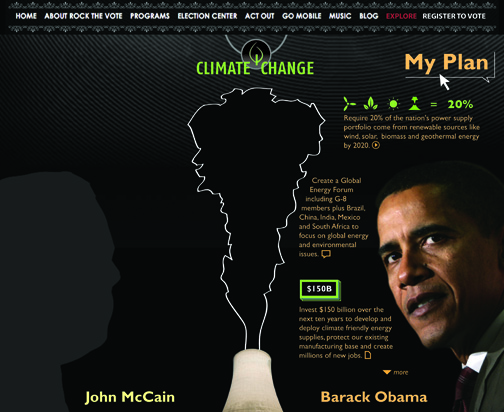
As she explores the issue of climate change, she gets a quick visual representation of the emission reduction targets McCain and Obama have laid out. Why the difference in targets? And more importantly, how do they plan to reach them?
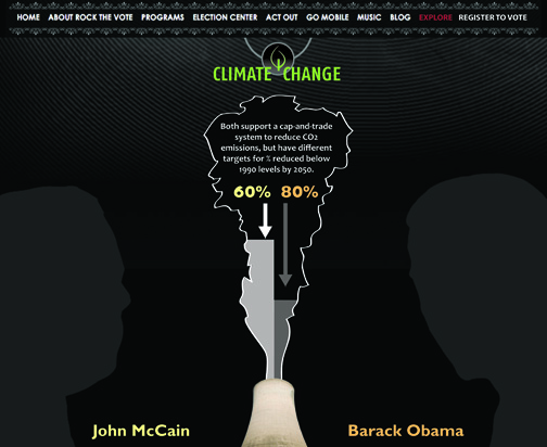 (Concept webpage design by 3Strand Innovation)
As Jane rolls over the left half of the page, she gets a glimpse of John McCain’s plan to address climate change. She is presented with a more visually-driven display of information, using iconography, abridged text and interactive website features. While these may seem like minor details, they allow her to explore and find surprises as she navigates through the site.
 (Concept webpage design by 3Strand Innovation)
Similarly, as Jane rolls over to the right side of the page, she gets a snapshot of Barack Obama’s plan to address climate change. All she has to do to find out more about Obama’s proposal for a Global Energy Forum, is click on that piece of information to link to the quote source. She can also directly link to videos and articles to give context and an added level of detail.
(Concept webpage design by 3Strand Innovation)
DESIGN SUMMARY:
While this is just scratching the surface of a design exploration of how to engage young voters in election 2008 through the web, it touches on an overarching opportunity. There is no reason why political websites should continue to look like they were assigned to be done by interns in their spare time.
Design of the user experience, from the interaction to the graphics to the incorporation of existing technology and social networks, determines whether candidates can connect with the rising generation of Millennials. Like it or not, using targeted design to penetrate this market on the most important issues of the day will play a critical role in the 2008 election as well as elections to come.
This segment is part 2 in the series : Redesign That: Design That Moves Politics?
1 2
