
categories
HOT TOPICS
- The Accelerator Conundrum
- The Startup Velocity Question
- Platform as a Service
- Man and Superman
- Web 3.0 = (4C + P + VS)
- The Future: End of Capitalism
- Capitalism 2.0

Designs of the Week: Blogs
By guest authors Charles W. Bush and Kathy Hwang of 3Strand Innovation, a brand, design and business consultancy.
Thanks so much for your feedback last week on ways to improve the user interface design for SramanaMitra.com. Based on your comments, it looks as though the recurring themes are:
1) Readability/Distraction Points: Use of flash, ads, font size and color, number of pages
2) Ease of Navigation: Header tabs, tags, related posts
3) Visual Engagement: Photographs, color application, layout and alignment
4) Social Networking: Connect to other readers, most-viewed articles, help facilitate discussions
Following this train of thought, this week we’ve picked examples of blogs that have great user-interface design. And since so many people commented on advertising banners being a source of distraction, we’ve also pulled out some extra examples of well-designed advertising spaces.
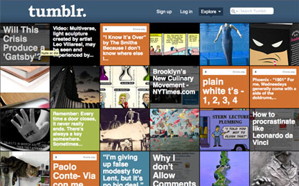
Tumblr
This site has probably come the farthest in re-envisioning the interface of traditional blogging. Tumblr aggregates posts from different blogs and gives them a fun visual navigation through quick, mixed-media posts. The visual engagement and extreme simplicity make it an appealing fresh take on blog interaction.
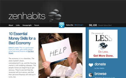
Zen Habits
This blog probably has the best design of their advertising space. They leave a lot of negative space on top and the side margins, giving an immediate sense of being clean and organized. Their advertisements are neatly placed in a darker blue column, using the contrast and color to let viewers focus on the body of the content in the white sections.
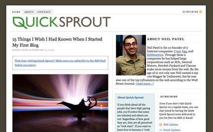
QuickSprout
Simple. Clean. Professional. And a good use of images to draw you into each of the posts. We also like some of the social networking and knowledge sharing links he included, such as “Top Commentors,” “Find Me Online,” and “Killer Blogs.”

AI Alex
While this site may feel a bit too much like Apple Computer’s, we really enjoyed the smooth interface of scrolling between popular posts, recent posts and recent blurbs. It’s a fun interaction while saving a lot of space.
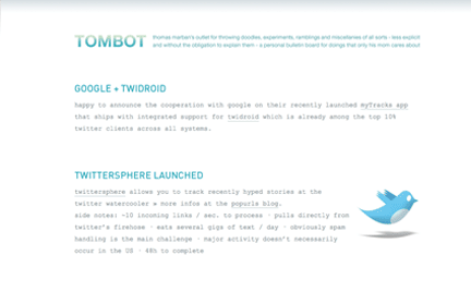
Tombot
Tombot embodies minimalism. Navigation? Search menus? Who needs them? Okay, maybe some of us do. Nevertheless, this site is still a great example of how a super-clean design can make the day feel just a little more pleasant.

Eleven3
This site manages to feel clean, despite the many visuals and images present on the page. We especially liked how key quotes were pulled out and designed into the text, reminiscent of reading print articles from magazines or journals. Their menu topics also have a nice interactive animation to them.
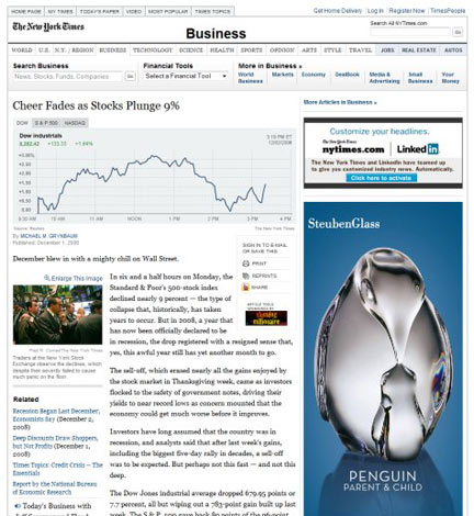
New York Times – Business
This one is not a blog, but we found it to be a good example of good design of the advertising space. NYTimes uses a strong and consistent grid system, which helps the ads not distract from the content.
This segment is a part in the series : Designs of the Week
