
categories
HOT TOPICS
- The Accelerator Conundrum
- The Startup Velocity Question
- Platform as a Service
- Man and Superman
- Web 3.0 = (4C + P + VS)
- The Future: End of Capitalism
- Capitalism 2.0

Designs of the Week: Blog Ad Space
By guest authors Charles W. Bush and Kathy Hwang of 3Strand Innovation, a business brand experience consultancy.
How do you design web advertising into a blog, without it becoming an eyesore and a bad experience for readers? Naturally, these decisions will be a trade-off. You can’t just get rid of all ads and ignore your revenue stream. But you also can’t create a simple design and a pleasant reader experience, while scattering advertising distraction points all over the page.
We sifted through over 100 blogs, specifically looking for good design of the Adspace, and the results were…extremely underwhelming. Honestly, it’s an area that most blog sites haven’t quite figured out yet. But to offer some examples for inspiration and analysis, here are a few blogs that seem to have given a bit more thought to designing their ad space.

Designers Who Blog
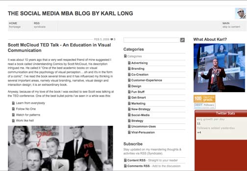
We saw several sites using both color and placement to mark out their advertising space. This site gives readers the visual cue that all advertisements will be placed on the right hand side within the khaki-colored column. It keeps its ads visually separate from its navigation column, and highlights its article content in the white space. This helps keep a clean design that is easily readable.
Experience Curve
This site similarly has clearly defined columns for content, navigation and advertising. Even with the ads, it is still able to keep an overall minimalist brand, with limited color applications, few font changes, and enough built-in white space on the page.

NOTCOT
Last week, we loved the fun user interface of Tumblr: using visual articles laid out in a grid of boxes. But how do you design advertising into that without going into visual overload? NOTCOT takes a similar approach to Tumblr, but incorporates ad space into the box grid system. This is one of the most creative ways we’ve seen websites give advertisers a significant footprint, while still giving users a fun navigation interface.
TechCrunch
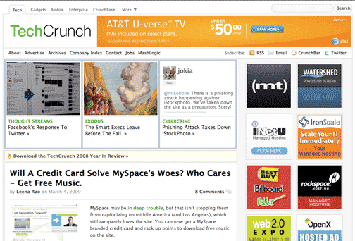
This site has a lot of ads and can be visually overwhelming, but where it does a great job is in organizing the ads into the layout. They are able to seamlessly incorporate the horizontal banner ad into the header space. TechCrunch’s smaller square ads on the right also manage to keep an organized look that is clearly separated from the content.
Core77
This site uses a mix of Google word ads and flash banner ads, which helps reduce the number of visuals competing on a page. Ad space is consistently placed in either a dark gray horizontal box or in the right-hand light gray column.
This segment is a part in the series : Designs of the Week
. Furniture
. Steampunk
. The Movie Theater Experience
. Desserts
. Social Entrepreneurship
. The Hearth
. Redesigning the Wine Experience
. Organic Furniture Design
. Simplicity
. Political Campaign Posters More »»
. Kitchen Design
. Blogs
. Blog Ad Space
