categories
HOT TOPICS
- The Startup Velocity Question
- Platform as a Service
- Man and Superman
- Web 3.0 = (4C + P + VS)
- The Future: End of Capitalism
- Capitalism 2.0

Redesign That: Online Personal Finance (Part 4)
By guest authors Charles W. Bush and Kathy Hwang of 3Strand Innovation, a brand, design and business consultancy.
These past few weeks, we have pretty much been living and breathing money management in our quest to find ways to improve the design of the user experience. Now it’s time to choose the lucky website to be redesigned. Quicken? Mint? Yodlee?
And the winner is…WESABE!

Wesabe is a relative rookie (started late 2005), but is also the first mover in its industry to really start integrating web 2.0 into personal finance. In about three years, it has created a strong social network of hundreds of thousands of Generation Y users and has shown tremendous growth. While compared with veterans such as Quicken, Wesabe is still a fledgling in its function and feature capabilities, but it’s in a position to have the most potential to grow and reshape the industry. Now for the fun stuff.
Here is a snapshot of Wesabe’s current website design:
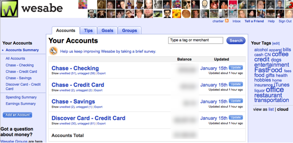
Wesabe's CURRENT homepage
We were so excited when we heard about their fresh approach to personal finance, that when we signed up for an account and went to their site, we felt a bit let down. Our first impression from using Wesabe’s site is that it looks as though it was designed by programmers. The tabs, subject headings and tags are all there and functional, but it does not feel as though there was as much thought given to the design, layout or usability. In such a competitive market, with strong entrants like Mint and PNC’s Virtual Wallet, this simply won’t cut it for long. As a service that focuses on user-generated content, Wesabe will need to give more attention to the user’s engagement and ease of interaction with the site.
In our redesign, we wanted to make sure we kept key aspects of Wesabe’s Web 2.0-savvy brand elements:
- a strong visual presence of user interaction on the site
- emphasis on tagging spending categories
- user comments and speech bubbles
- simple layouts and color schemes
Focusing on the target Generation Y users, we also wanted to make the site feel youthful, easy and relevant to their needs. Much of this younger population struggles with credit card debt, student loans and trying to find tangible ways to save. They draw upon Internet social networks to encourage each other and offer tips on how to reach their financial goals.
Below is a sneak peak at how we would approach redesigning Wesabe’s home page. We’ll go into the detail of the designs and features next week. Stay tuned.
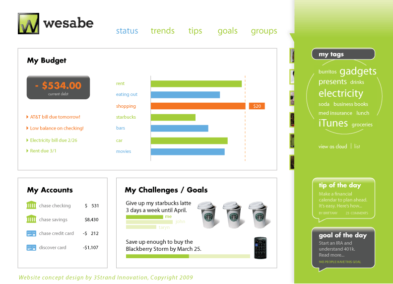
3Strand's REDESIGN Concept of Wesabe.com
This segment is part 4 in the series : Redesign That: Online Personal Finance
1 2 3 4 5 6 7
Featured Videos
Can 1M/1M Help Me Raise Money?
How Does 1M/1M Democratize Entrepreneurship Education?
How Does 1M/1M Democratize Management Consulting?
When Is The Right Time To Join 1M/1M?
Can 1M/1M Help Me With Business Development?
Can 1M/1M Help Me With Market Sizing?
Can 1M/1M Help Me Validate My Product?
Will I Have Private 1-on-1 Sessions In 1M/1M?
How Does 1M/1M Help Entrepreneurs Connect With Silicon Valley?
Mentoring or Consulting?
Why Does 1M/1M Charge $1000 a Year?
Why Does 1M/1M Partner With Local Organizations?
Why Don\’t Mentoring Networks Work?
Why Is It Important To Study With 1M/1M Now?
Dan Stewart Story
Vikrant Mathur Story